Most car drivers have already had experience with empty starter batteries. This annoying annoyance often occurs after long periods of downtime and can usually be avoided with a suitable charger. But what does an interface for a charger have to look like so that it can also be used by technical amateurs? Which functions are really relevant to offer the operator added value?
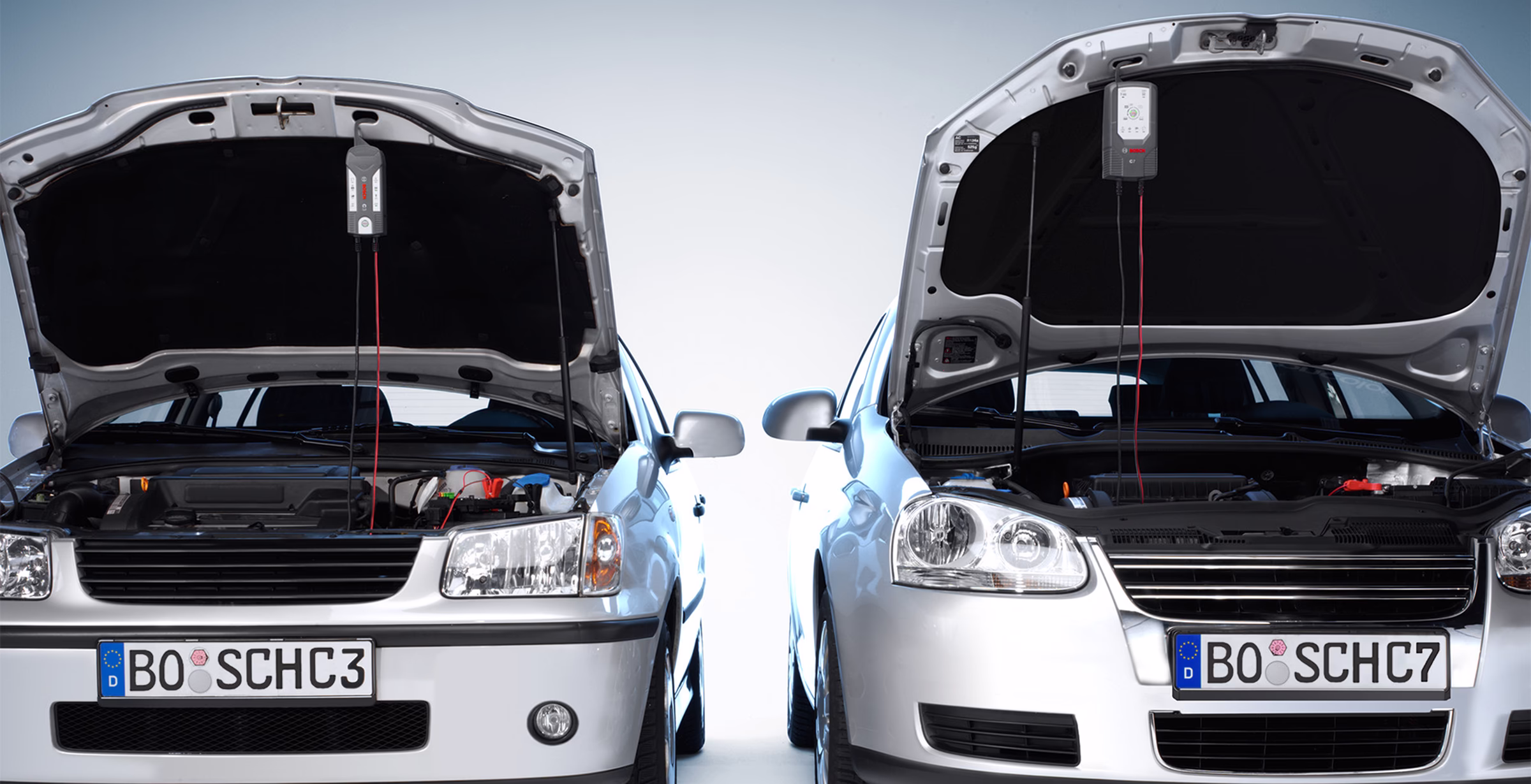
Robert Bosch GmbH has commissioned Projekter Industrial Design to develop the design of two chargers of different performance classes in the consumer sector.
It began with a detailed analysis of the properties that are really important for the user.
INFORMATION
- Current activation state
- Selected charging mode
- Battery charge level
FUNCTION
- Required charging function
- Medium for information output
- accessory
HANDLING
- Control elements/buttons
- Orientation of the device
- Orientation of cable outlets
ANALYSIS OF FUNCTION AND HANDLING
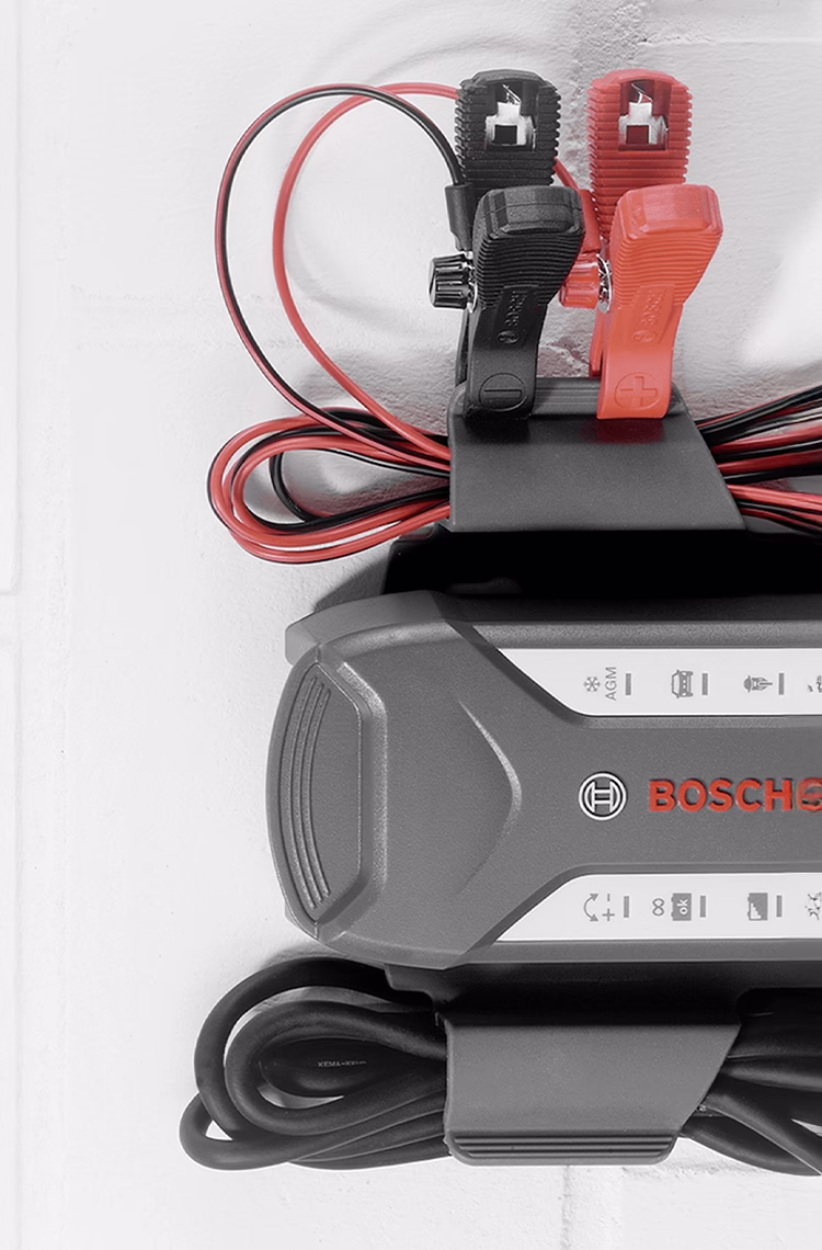
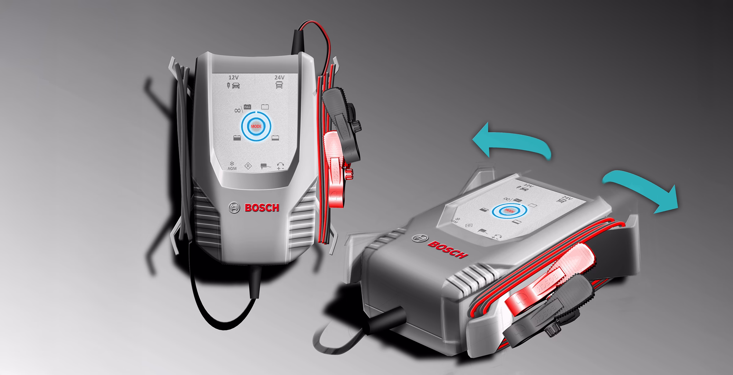
In user tests, a vertical orientation of the charger proved to be particularly advantageous both when holding in the hand and in stationary or semi-stationary operation. The conventional distribution of cable outlets on the two short sides of the housing is rather a hindrance. The cables are often in the way.
The resulting positioning of all cables on a common side also had a positive effect on interface design. Both when hanging and holding the device in one hand, it is very easy to read the status information and operate it with one hand. The cables always hang down bundled together and cause as little interference as possible.
USER INTERFACE
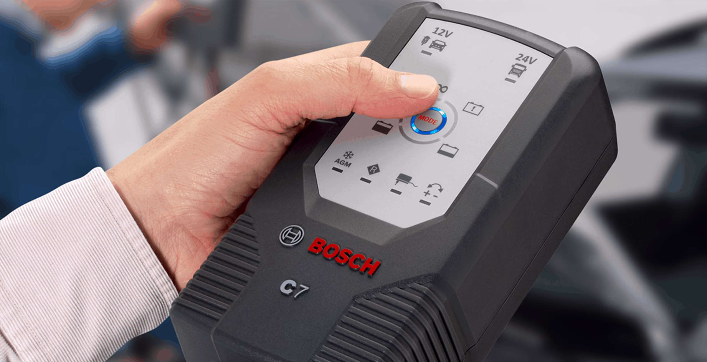
Right from the start, the goal was to develop an interface that only provides the user with the information they really need. For example, the exact information on the battery voltage on a display is usually not at all understandable to normal Otto consumers. Only a few know that a normal 12V starter battery is almost empty at a voltage of 12.0V and is only considered fully charged from 12.8V. According to the motto “Design for All” (DfA), it makes much more sense to put this information in a form that is understandable to everyone.
In particular, this included a largely language-neutral design of the user interface. We have translated all information about device functions and charge status into easy-to-understand symbols and LEDs of different colors. This enables the devices to be sold worldwide without changes to the interface. Both chargers can be held, operated and read comfortably in one hand.
Many settings, such as the charging voltage or controlling the charging curve, are made automatically by the microcomputer controller, depending on the connected battery. As a result, we were able to implement an interface design with just a single button. The operation was therefore extremely understandable and clear.
CONCLUSION
It is not always just about faster, farther, higher, more functions and features, but about which characteristics really offer the user an advantage. The focus here was clearly on interface design. The user interfaces of the loaders deliberately avoid any bells and whistles such as digital displays.
The two Bosch C3 and C7 chargers received the Red Dot Design Award 2011. Would you also like us to design a product? Then contact us!